How to Launch a New Brand on the Web: From TripActions to Navan

Tomas Lloyd-Butler


Launching a new brand on the web is no easy task. See what it took to create and deliver the new Navan web marketing design system.
Since 2015, TripActions has been disrupting the corporate travel and expense market with user-centered design and increasingly advanced technology. As the TripActions technology suite grew with multiple solutions, it became time to bring them together under one unified name.
Introducing
Are you amazed? Are you itching with excitement? Of course not. All I did was write a couple words using marketing speak. After all, what’s a brand without visual representation? So let’s get down to the nitty gritty of what it takes to deploy a new brand design on a marketing website.
My Role in the Project
My role as the Web UX Designer was to build an entirely new brand design system for the Navan marketing website using the concepts and preliminary guidelines set forth by our brand and product teams.
I was responsible for delivering the following:
- New homepage concept to be approved by the leadership team
- New typography guidelines
- New web component library
- New color guidelines
- New button and link guidelines
- New product graphics showing new product brand design
- Integration of new photography style
- Page reskin guidelines
There were many other requirements that I won’t bore you with but needless to say, there was a lot to get done — and tight deadlines to hit.
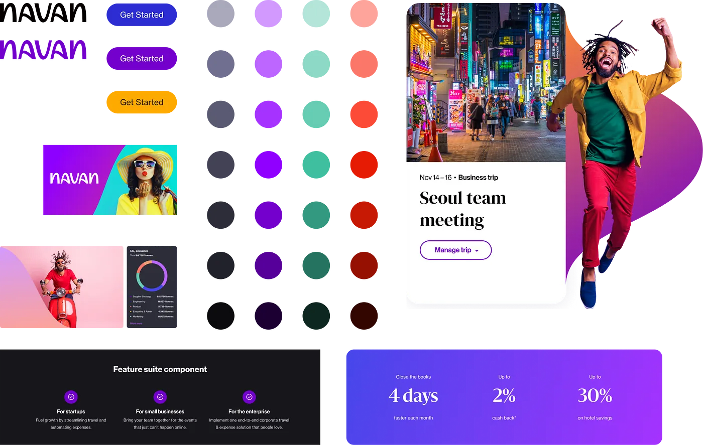
Lots and Lots of Components
After we identified the necessary pages to publish under the new brand, it was time to work on the components that would make up those pages.
Remember, we’re moving fast. Rebrand launch is just around the corner, and we have to get the ball rolling as quickly as possible.
So I narrowed our component list down to the ones that appear on the majority of the website’s pages. I focused on designing ones that our developers could build while I continued to design more components. It became sort of a cat-and-mouse game.
A zoomed-out view of some Navan components
Here are some key points to keep in mind when designing or redesigning a component:
- Variations. Will the component contain multiple variations? Can it be multiplied? Will there be a minimum or maximum to its multiplication? What does each variant look like in detail?
- Content variables. What happens if the content creator leaves a field empty? How will the rest of the component react to an empty field?
- Localization. A headline might fit perfectly in that space, but what happens if the headline is in German? I bet it doesn’t look so great anymore, does it? How do you fix that?
- Grid layout. Will this component use a universal grid layout? Will it contain multiple grids within itself?
- Padding and margins. Your developers are moving fast; they don’t have time to waste clicking into your Figma frame to see exactly how many pixels are between the headline and the subheadline. What can you do to help them, and how can you do it quickly and efficiently?
- Communicate. It’s important to maintain communication with your dev team throughout the entire process. They’re counting on you to let them know if there have been any changes to the design system. Also, they’re going to have a ton of questions — because even though you think you designed the heck out of every detail, they’re going to find something you missed.
There’s a lot to think about with every component. But the good news is, it gets easier with every component you perfect. You’ll get into a rhythm, and eventually you’ll be pumping out components like eggs from a hen.
Buttons, Colors, Typography
I’ll admit, I was able to skip a few steps here thanks to the help of our brand and product team members. who Before I started work on this project, they had established the new fonts and colors, as well as the button styles and states. But the design rules of a product do not always apply or translate to the marketing website.
For instance:
- Colors. Your product team might use red as a way to identify a user’s mistake or error. But you might find that red or yellow can be used instead to mark valuable CTAs that keep a user moving further down the funnel. Use your analytics and testing to justify any changes you make here … and be prepared to defend your decisions.
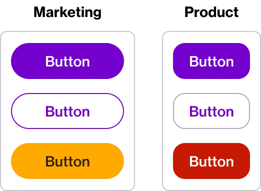
What works for the product may not work for the web
- Space Constraints. Your components will be different from those the product team is using, so you’ll run into areas where you might need to change your typography structure to accommodate larger fonts or wider images.
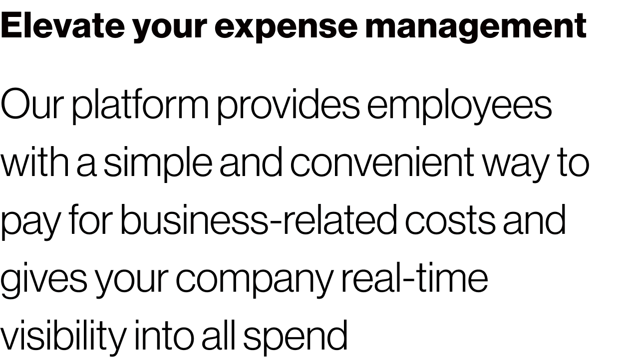
- Text tokens. Sometimes you have to get flashy with marketing pages — it’s a marketing thing. So you’ll have to come up with your own tokens, like this example of a paragraph where I needed a larger font (something that would never get used in the product).
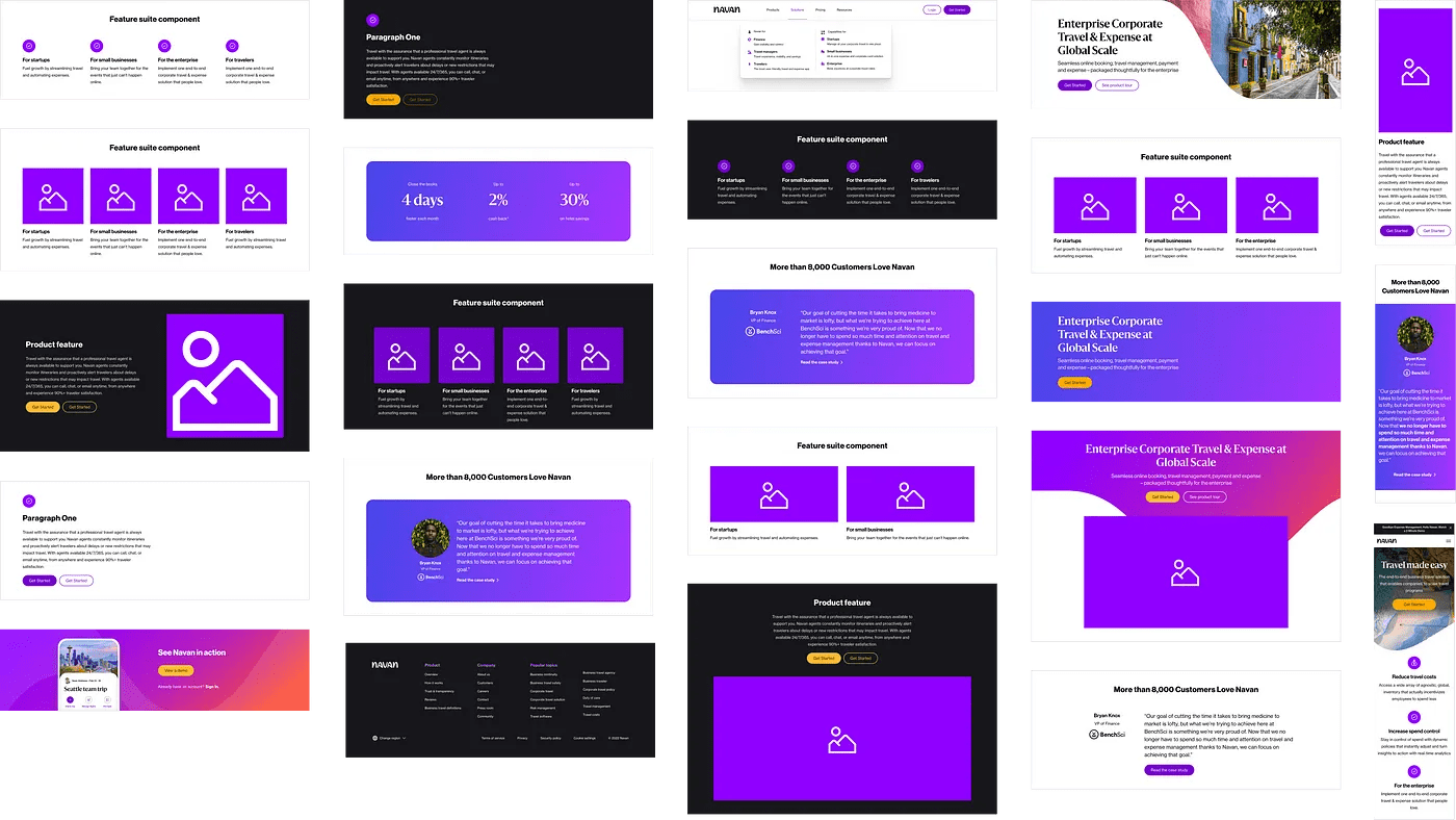
Product Graphics
Photography Style

Our photography style moved from a stringent enterprise format to something more fun and consumer-friendly. I used a similar approach to the product graphics and made a library with jump-to links to various theme sections in Figma. There are many other solutions for storing your photo library; I just found it easier to keep all of my content in Figma so that I could see everything all in one location and paste images directly into my product graphics.
To Build or Not to Build
Even though you’re kicking butt on the rebrand project and you’re making good progress, you may still find there are a ton of web pages left over with the old brand colors and styles. If there’s no way your developers will have enough time to rebuild those pages by the new brand launch date, you have some decisions to make.
- How’s the traffic? Check your analytics to see if the web page gets a decent amount of traffic. If you haven’t had a single user in the past month, it might be time to sunset that page.
- How’s the lift? Before you spend a ton of time redesigning a page and its affiliated pages, have a discussion with your developers and ask them what they think. They might tell you it’s easier than you thought, or they might tell you you’re crazy for even thinking they’d be able to rebuild such a complicated page. (And how dare you!)
- Is it really necessary? Does the page really need to be redesigned and recoded? Take a long — but not too long — look at the page. What if you updated the colors and fonts to match the new brand? How does that look? Looks pretty good, doesn’t it? This is what we call a reskin.
What the heck is a reskin?
A reskin is when you update the basic CSS properties of a web page; it can have a dramatic effect on the page’s appearance without having to do any heavy coding. Simple updates that require very little time can give your pages a whole new look.
If you feel like you’re half-assing the project, don’t worry — you’re not. You’re doing what has to be done to be prepared for the launch date. You’ll have plenty of time to revisit these pages post-launch.
Post-Launch Review
Brand launches involve a lot of moving parts across multiple departments, so naturally tensions will run high the closer you get to the launch date. Here are some things to keep in mind when you’re in the thick of it.
- Don’t be an ass. Be kind, be honest, communicate, give thanks, and compliment. After the dust has settled, you don’t want to have a list of people you need to apologize to because the stresses of the brand launch got the best of you.
- Snowflakes will melt. You’re going to be receiving design critiques like rapid fire, so be ready to use the suggestions you’re given to strengthen the foundation of your designs. Try not to get overwhelmed by all the judgment — use it to your advantage.
- Embrace the experience. A new brand launch is an exciting time for any company, with plenty of opportunities for new experiences that you can add to your portfolio. If you find your workload is light, request to be given more tasks. Get involved — there’s bound to be a team that could use your help.
I hope you’ve found this review of Navan’s brand launch useful. I’d love to hear stories of your brand launch experiences in the comments.
Visit navan.com to see this design system in all its glory.
This content is for informational purposes only. It doesn't necessarily reflect the views of Navan and should not be construed as legal, tax, benefits, financial, accounting, or other advice. If you need specific advice for your business, please consult with an expert, as rules and regulations change regularly.
More content you might like
Take Travel and Expense Further with Navan
Move faster, stay compliant, and save smarter.